Aura
BRANDING/PACKAGING
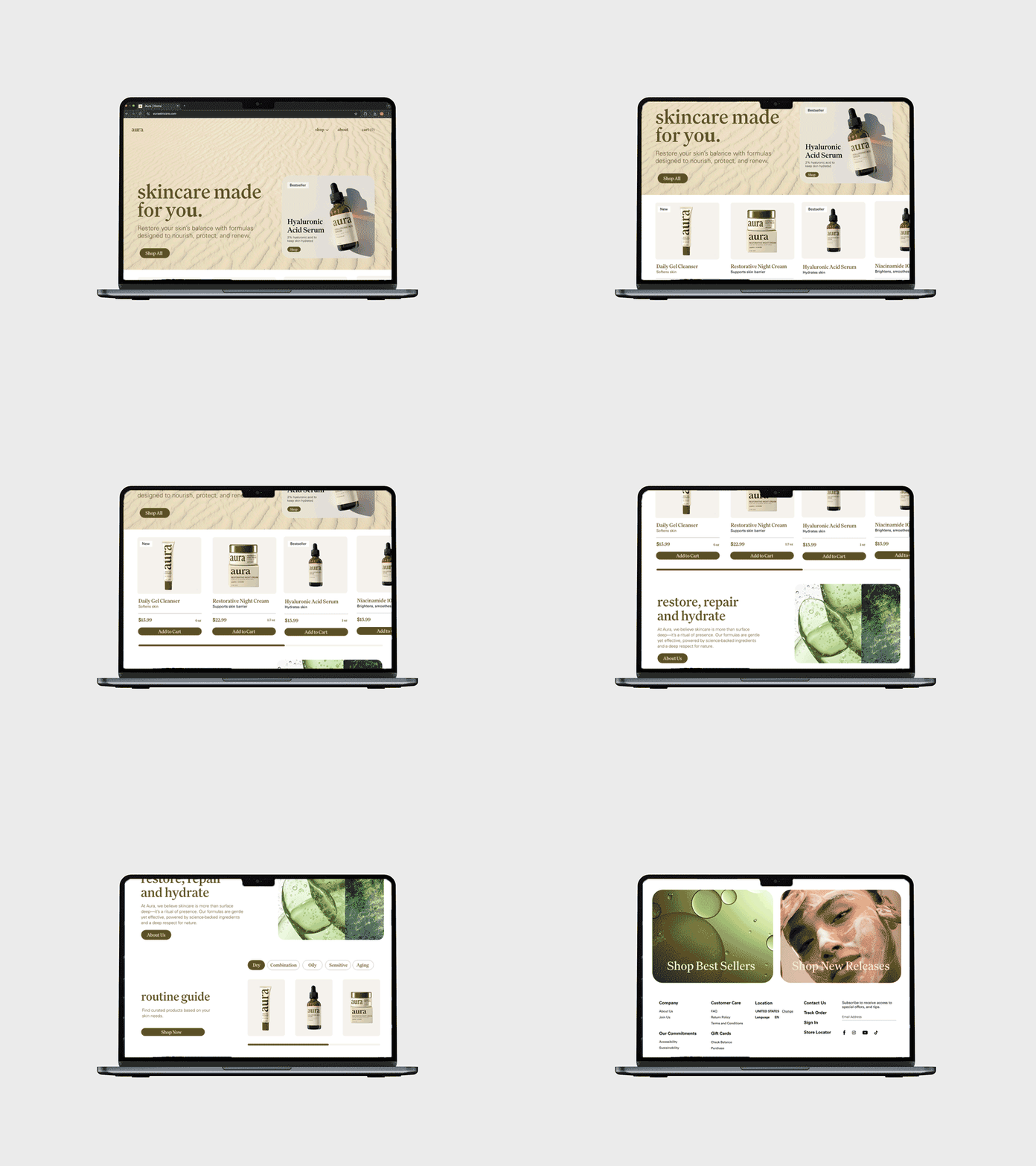
Aura takes a quieter, more intentional approach. The brand centers around balance - between science and nature, simplicity and depth. The visual identity is rooted in softness and calm, with an emphasis on personal ritual.
A subtle boldness in the logotype's "u" becomes a design motif, reinforcing the brand’s focus on you. Earth-toned packaging, delicate typography, and nature-based imagery support a system that feels grounded, and human.


